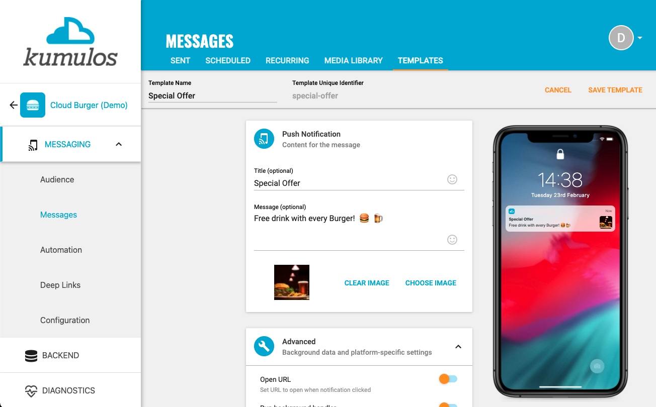
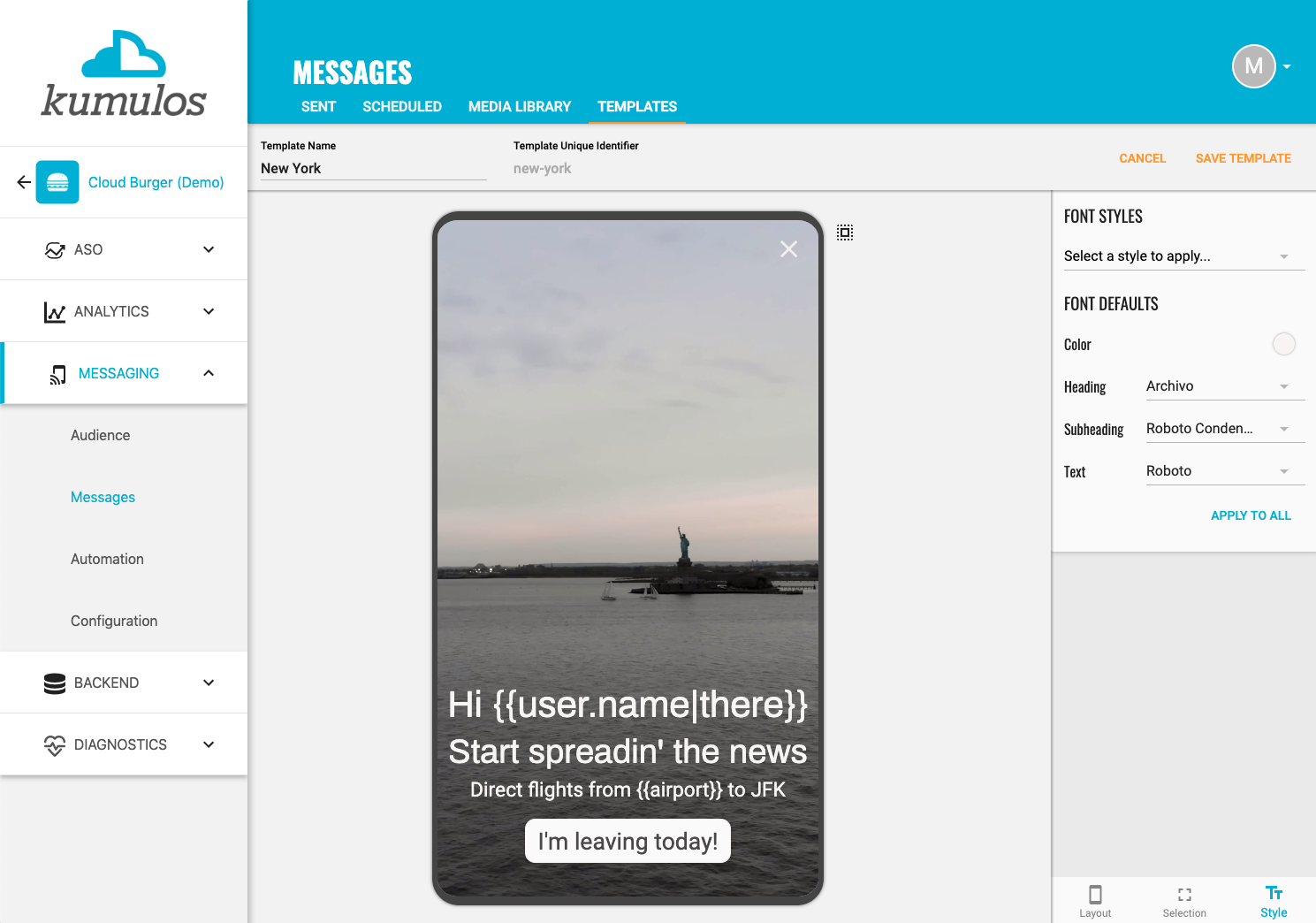
Templates
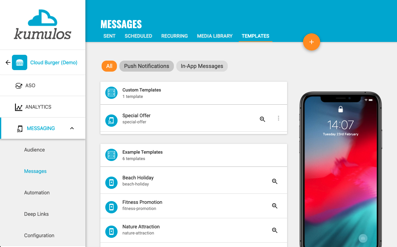
You can design templates that can be used when you and your team are sending push or in-app messages via the console, via the Messaging API or via Automations. To access the template library for an app, click on the app, expand 'Messaging' in the left menu, select 'Messages' and then 'Templates'.
Working with Templates
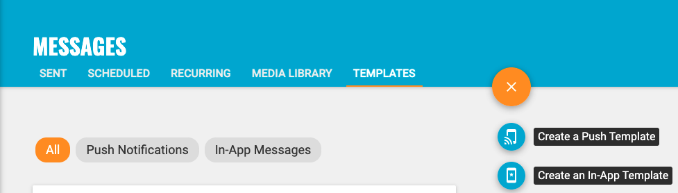
Each app has a number of example templates to illustrate the different styles of push and in-app messages you can send. You can then add your own templates to your template library by clicking the "+" primary action button.
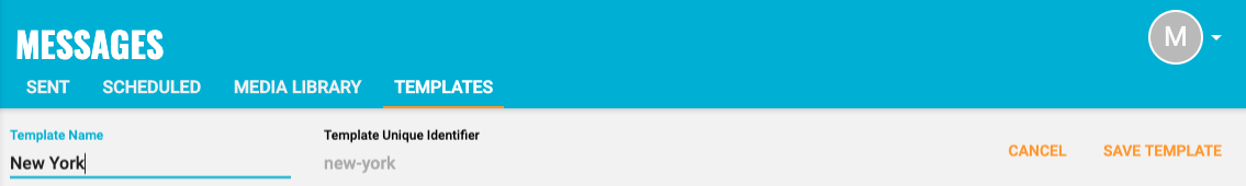
Create your template and then click 'Save Template' when done.
To view an existing template, simply click on that template and it will be shown in the preview on the right-hand side. To edit a custom template, expand the menu next to that template and click edit. Make any changes and then click 'Save Template' when done or click 'Cancel' to discard your changes.
To delete a custom template, expand the menu next to that template and click delete.
Name and Identifier
You must give each template a name to identify the template when sending a push or in-app message or using in an Automation. From the name, a unique identifier will also be generated - this is required to use the template via the Messaging API.
Push Template Content
As you add content to the notification you can preview how the notification will look on a user's device. By default, the preview shows how the notification will look when it arrives on an iPhone.
Click the Android tab to see how the notification will look when it arrives on an Android phone.
If you have added an image or buttons, click the notification preview to see how it will look when the user expands the notification on their phone.
Personalization
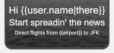
In your text, you can also add user attributes to personalize the message. Enclose user attributes in double braces and include a default value {{user.attributeName|default('defaultValue')}}. The defaultValue will be used if the attribute attributeName is not set for a given user.
Image
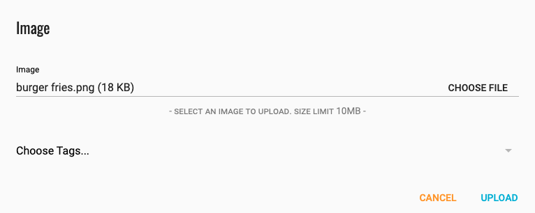
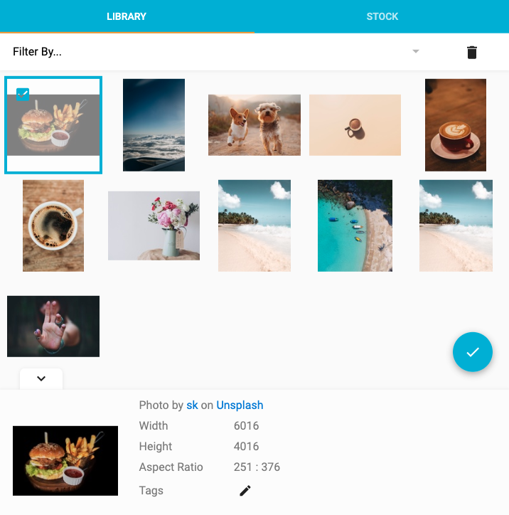
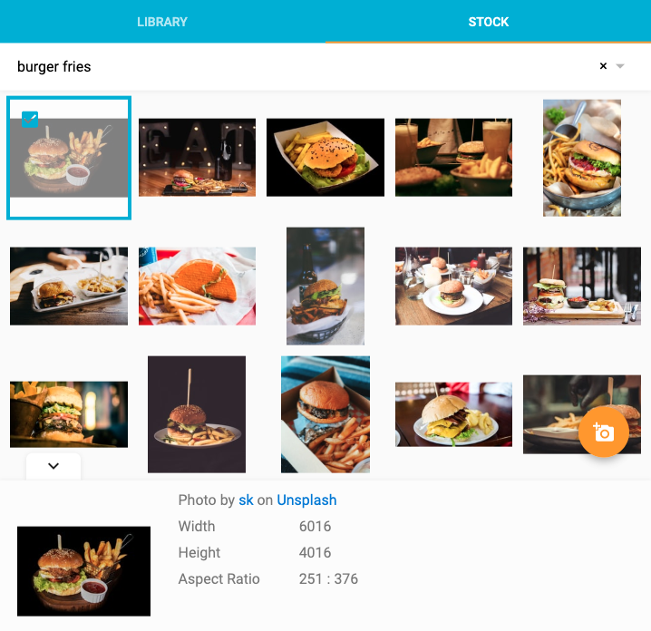
If you want to add a picture to your notification, click 'Choose Image' to open your Media Library. Here, you can upload a new image, select an image you have previously uploaded or search the Unsplash stock image library.
To upload a new image, click the upload primary action button. Click 'Choose File' to browse your computer and find the image. Select any tags to help you find the image later or to add a new tag, just start typing and click 'Create new tag'. Click 'Upload' to add the image to your media library and include this in your push notification.
To use an image you have previously uploaded, simply select the image and click the tick primary action button. You can either scroll through your library or filter by the tags you have added previously.
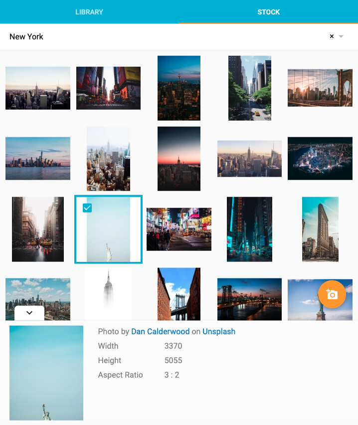
To use an image from the Unsplash stock image library, click the 'Stock' tab and enter one or more keywords in the search box. Scroll through the results and select an image to see more information about it. Once you have found the image, click the camera primary action button to add this image to your media library and include this in your push notification.
The preview will show how the notification will look when it arrives on a phone with a thumbnail image. Click the notification to see how it will look when the user expands the notification on their phone.
To remove the image from your push notification, click 'Clear Image'.
Advanced Options
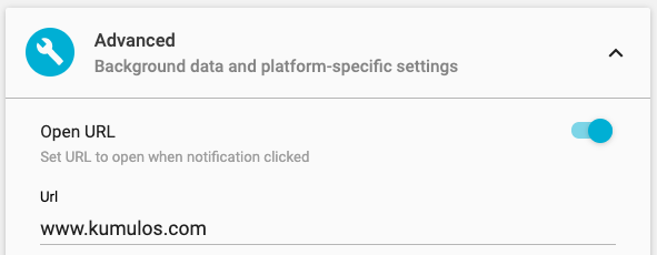
To open a URL, add a data payload or set any platform specific options, expand 'Advanced'.
This can be particulary useful for push templates to save JSON payloads which can act as destinations for push notifcations along with their relavant content.
Open a URL
To open a URL when the push notification is tapped by the user, toggle the "Open URL" switch and enter the URL you want to open.
Ensure that you have reviewed the appropriate SDK integration guides to support URL push
Background
To send a notification that can be processed in the background, toggle the "Run background handler" switch. The title & message become optional, and can be omitted to create a silent push.
On iOS this will set the content-available flag on the notification.
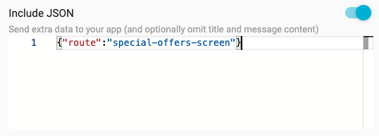
Data
To add an arbitrary meta-data object to the push notification, for example to trigger a deep link, toggle the "Data" switch and enter a valid JSON object into the editor. Additional data can be consumed by the SDK, please refer to the platform integration guides for further information.
Action Buttons
You can add upto three action buttons to a push notification by toggling the "Action Buttons" switch. Enter the identifier (used by your app to determine what action to take) and text for each button. To remove a button, click the trashcan icon.
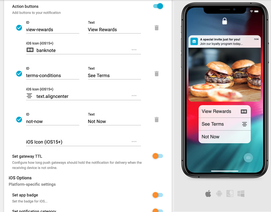
The preview will show how the notification will look when it arrives on a phone with a thumbnail image. Click the notification to see how it will look when the user expands the notification on their phone.
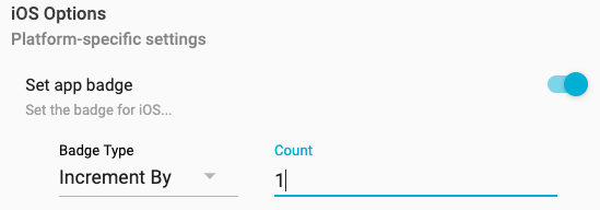
iOS Badges
To set the badge on your app on iOS, toggle the "Set Badge" switch. By clicking on "Badge Type" you can choose whether to set the badge to the absolute number you enter in "Count" or to Increment the badge by the positive or negative number you enter in "Count".
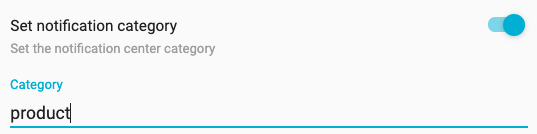
iOS Category
To set the category on your app on iOS, toggle the "Set Category" switch. Type in the category.
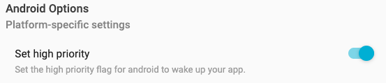
Android Priority
To set the priority flag and wake up Android devices, toggle the High Priority switch.
In-App Template Layout
First, you need to decide how to layout the template for your in-app message.
Frame
The frame type controls the size of the in-app message. Choose from fullscreen, inset or alert by clicking the appropriate icon.
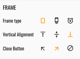
You can also choose whether sections should be vertical aligned to the top, middle or bottom and the position of the close button (top-right, top-left or none at all if another close button is being added).
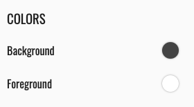
Colors
To change the background color or the foreground color used for text (this can be changed later) and button borders click the appropriate icon. This will open the color picker. Click 'Confirm' once you have selected the desired color.
Background
Image
To add a background image, click 'Choose Image' to open your Media Library. Here, you can upload a new image, select an image you have previously uploaded or search the Unsplash stock image library.
To upload a new image, click the upload primary action button. Click 'Choose File' to browse your computer and find the image. Select any tags to help you find the image later or to add a new tag, just start typing and click 'Create new tag'. Click 'Upload' to add the image to your media library and use this as the background image for your template.
To use an image you have previously uploaded, simply select the image and click the tick primary action button. You can either scroll through your library or filter by the tags you have added previously.
To use an image from the Unsplash stock image library, click the 'Stock' tab and enter one or more keywords in the search box. Scroll through the results and select an image to see more information about it. Once you have found the image, click the camera primary action button to add this image to your media library and use it as the background image for your template.
To clear the background image of your in-app message, click 'Clear Image'.
Video
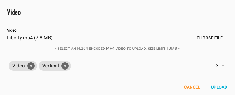
Alternatively, to add a background video, click 'Choose Video' to open your Media Library. Here, you can upload a new video or select a video you have previously uploaded.
To upload a new video, click the upload primary action button. Click 'Choose File' to browse your computer and find the video. Select any tags to help you find the video later or to add a new tag, just start typing and click 'Create new tag'. Click 'Upload' to add the video to your media library and then use this as the background video for your template.
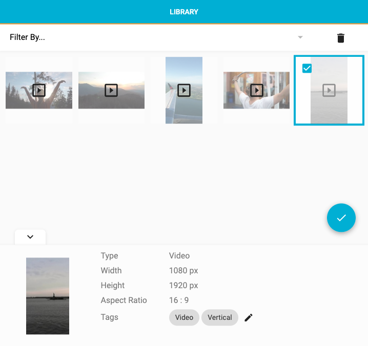
To use a video you have previously uploaded, simply select the video and click the tick primary action button. You can either scroll through your library or filter by the tags you have added previously.
To clear the background video of your in-app message, click 'Clear Video'.
Gradient
You can also apply a gradient over the background color or image. Select the Top and Bottom color for the gradient using the color picker. If you are applying the gradient over a background image, you may want to adjust the alpha of the colors to aid readability of any content you add.
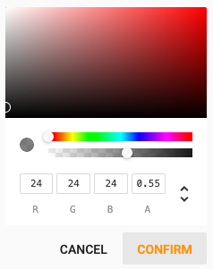
Using the sliders, you can then adjust the blend of the gradient.
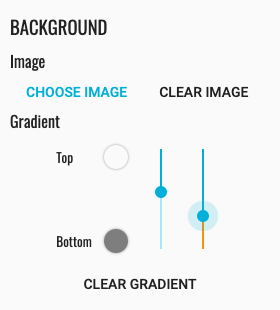
To clear the gradient, click 'Clear Gradient'
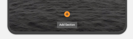
Adding Sections
You can build up the content of your template by adding one or more sections. Sections can be Headings, Subheadings, Text, Images, Videos or Buttons and will be added in order according to the vertical alignment of the Frame.
To add a section, click the '+' icon and select the type of section you want to add.
To make it easier to see the sections in the template, toggle the border icon at the top-right of the message. To remove a section, select it and then click the bin icon in the selection pane on the right hand side.
Remember to click the 'Save Template' button when you have finished your template.
Headings, Subheadings and Text
To add a Heading, Subheading or Text to your in-app message, click the '+' icon, select the type of section you want to add and type in the section box.
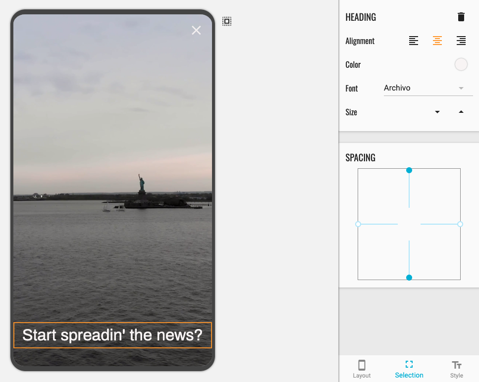
In the right-hand selection pane, you can change the alignment, color, font and size using the appropriate controls. You can also add padding around the text by adjusting the spacing sliders.
Dynamic content
In your text, you can add dynamic content tags that will be replaced when the message is sent via the console, via the Messaging API or via Automations. For example, so a designer can layout and design a template that mobile marketers can then use when sending campaigns. Dynamic content tags are enclosed in double braces as follows {{tagName}} where tagName will be used to identify the tag to be replaced by the user in the console or the Messaging API when sending the message.
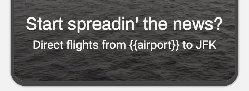
Personalization
In your text, you can also add user attributes to personalize the message when it is sent via the console, via the Messaging API or via Automations. User attributes are enclosed in double braces and include a default value as follows {{user.attributeName|default('defaultValue')}}. The defaultValue will be used if the attribute attributeName is not set for a given user.
Images
To add an image, click the '+' icon and select image. To upload a new image, click the upload primary action button. Click 'Choose File' to browse your computer and find the image. Select any tags to help you find the image later or to add a new tag, just start typing a new tag and click 'Create new tag'. Click 'Upload' to add the image to your media library and use this in your in-app message.
To use an image you have previously uploaded, simply select the image and click the tick primary action button. You can either scroll through your library or filter by the tags you have added previously.
To use an image from the Unsplash stock image library, click the 'Stock' tab and enter one or more keywords in the search box. Scroll through the results and select an image to see more information about it. Once you have found the image, click the camera primary action button to add this image to your media library and use it in your in-app message.
In the right-hand selection pane, you can add padding around the image by using the spacing sliders.
Videos
To add a video, click the '+' icon and select video. To upload a new video, click the upload primary action button. Click 'Choose File' to browse your computer and find the video. Select any tags to help you find the video later or to add a new tag, just start typing a new tag and click 'Create new tag'. Click 'Upload' to add the video to your media library for use in your template.
To use a video you have previously uploaded, simply select the video and click the tick primary action button. You can either scroll through your library or filter by the tags you have added previously.
In the right-hand selection pane, you can control whether the video should Autoplay and whether it should Loop using the appropriate toggles. Please note that if your video has sound, it will be muted until the user clicks on the video in the message as is standard practice.
You can also add padding around the video by using the spacing sliders.
Buttons
To add an image, click the '+' icon and select button and type in the section box.
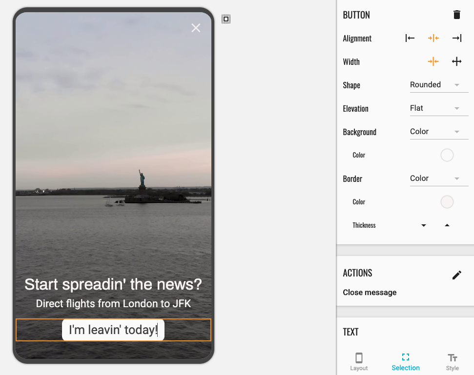
In the right-hand selection pane, you can change the alignment, width, shape, elevation, background and border of the button using the appropriate controls. You can also adjust the alignment, color, font and size of the button text and add padding around the button using the spacing sliders.
Actions
To add one or more action(s) to the button, click the actions pencil icon.
- By default, buttons will close the message. If you do not want this to happen, click the 'Close Message' toggle.
- If you want to track an analytics event to measure conversion, select the appropriate event from the drop-down.
- If you want any users who click the button to be subscribed to a channel (to opt-in to receive further promotional messages for example), select the channel from the drop-down.
- Finally, select where the user should be taken if they click the button (e.g. prompted to subscribe to push notifications or deep link into the section of the app specified by the JSON code).
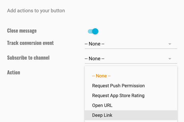
Click 'Done' to set the actions for the button.
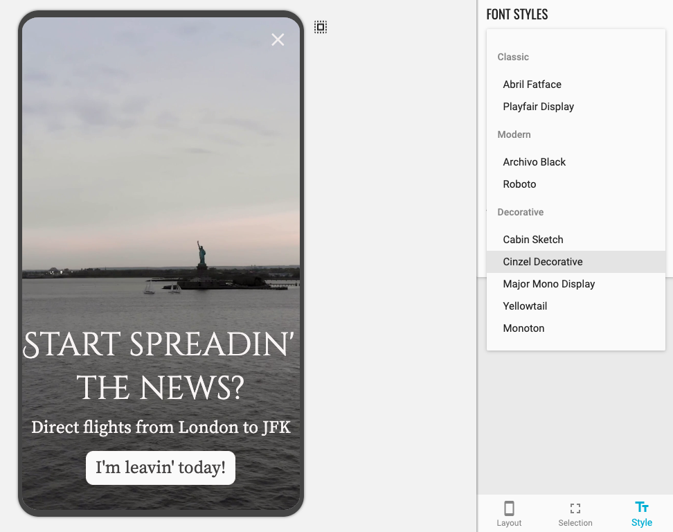
Font Styles
While you can change the font and color of individual sections, you can also quickly change the font and color of all sections in the 'Style' tab on the right-hand side. Simply select the desired font for each type of section and click 'Apply to all'.
Alternatively, you can quickly see how your template would look with different combinations of modern, classic or decorative font styles.