Overview
Reporting lets you generate weekly and monthly reports for your clients, summarizing who is using their app, how engaged they are and how the app is responding. Once enabled, you can run as many reports as needed, annotating and customizing the content if required prior to delivery to your client. If you have applied your branding to your console, then each report will also contain your logo and colors. This is all explained in the following short video...
Enable Reporting
To enable reporting for an app, go to the App Dashboard for that app and click on the Reports tab.
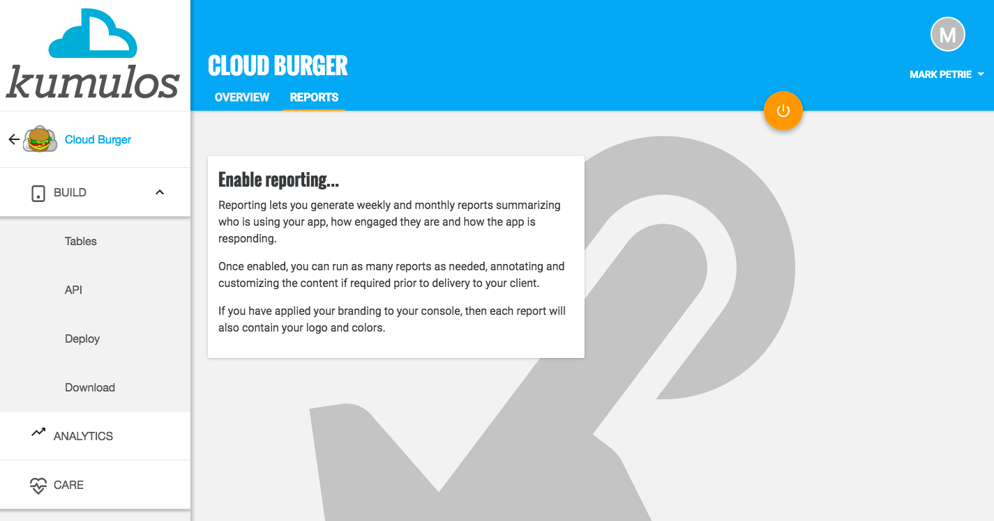
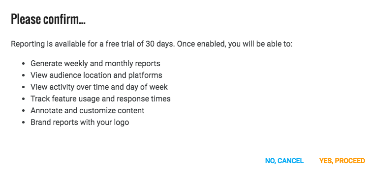
Click on the primary action button to enable reporting for this app, clicking YES,PROCEED when prompted.
A report will now be generated for the current calendar week for this app and you will be redirected to view its contents.
Generating a Report
Once reporting has been enabled for an app, then you can generate as many reports as required from the Reports tab of the App Dashboard by clicking on the primary action button.
By default, reports are generated for the previous seven days from the current date. However, the date range can be changed to a calendar week, a calendar month, the previous 7 days or the previous 30 days from any date since 1st June 2015.
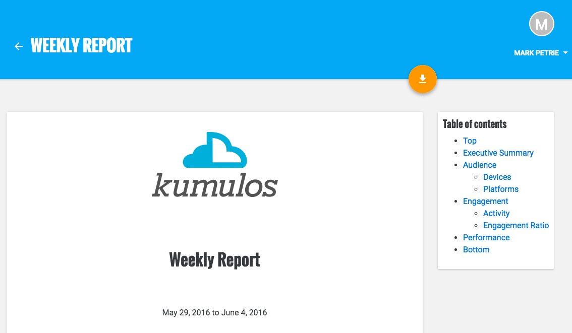
Viewing a Report
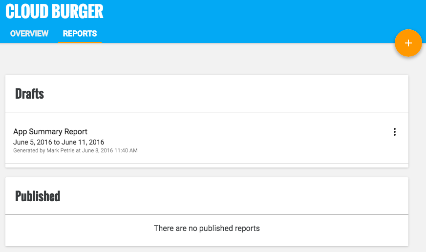
The Reports tab groups reports into Drafts and Published Reports. The contents of Draft Reports can still be edited, whereas the contents of Published Reports are read-only, visible to your client and can be downloaded as PDF.
To view a (draft or published) report, simply click on the report title.
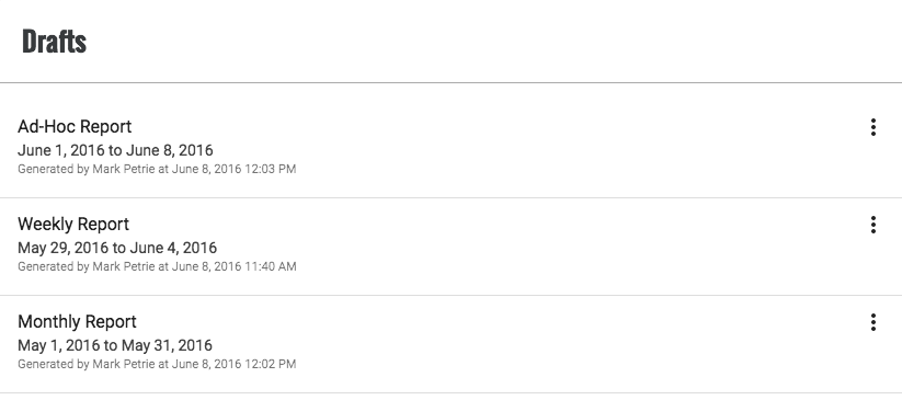
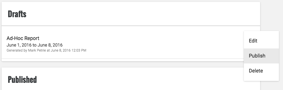
Draft reports
For each Draft report, you can see the title, the date range covered by the report, the author who generated the report and when the report was generated. To view a draft report, simply click on the report title.
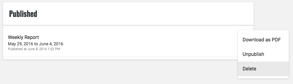
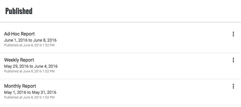
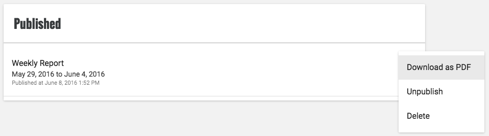
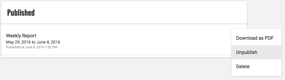
Published Reports
For each Published report, you can see the title, the date range covered by the report and when the report was published. To view a published report, simply click on the report title.
Report Contents
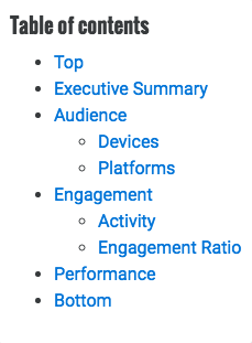
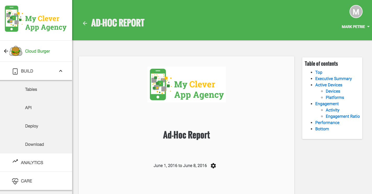
The App Summary Report provides you with a high-level view of the performance of your app, by summarizing who is using your app, how engaged they are and how the app is responding. You can navigate to any section in the report via the Table of Contents.
Audience
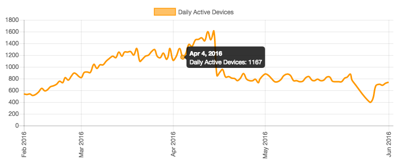
Daily Active Devices
The first chart shows on how many devices your app was used each day of the reporting period.
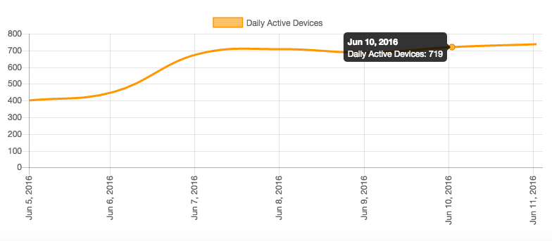
You can hover over a chart to see the value for that given point in the chart.
The second chart lets you compare the above with the number of devices on which your app was used for each of the last 120 days.
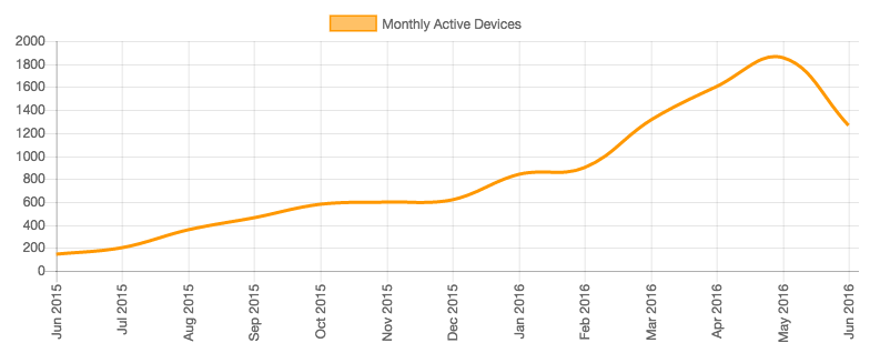
Monthly Active Devices
This next chart gives you the longer term trend by showing the number of devices on which your app was active each month for the previous 12 months.
Platforms
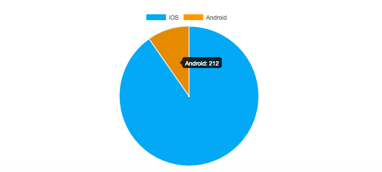
The pie chart shows the breakdown of the platforms on which your app has been used over the reporting period.
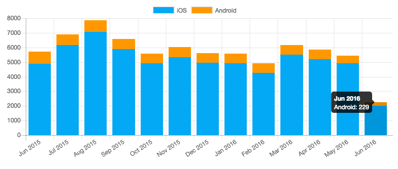
The stacked bar chart now lets you compares the above with the breakdown of the platforms on which your app was used for each of the past 12 months.
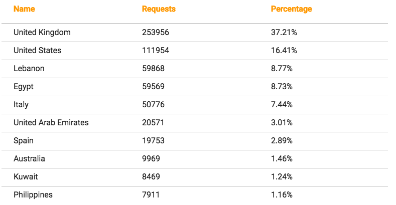
Location
The map shows you from where in the world your app was used. The larger the circle, the more usage of your app there was in that location.
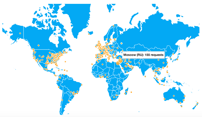
You can zoom in to areas of interest and navigate around the map using normal pan controls
The table shows the top 10 countries from where your app was used during the reporting period along with the percentage of total usage that represents.
Kumulos uses GeoLite2 data created by MaxMind and available from https://www.maxmind.com.
Engagement
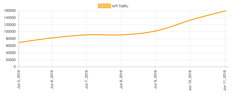
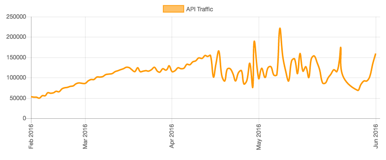
Activity
The first chart shows the API traffic generated by your app for each day of the reporting period.
The second chart lets you compare the above with the API traffic generated by your app for each of the last 120 days.
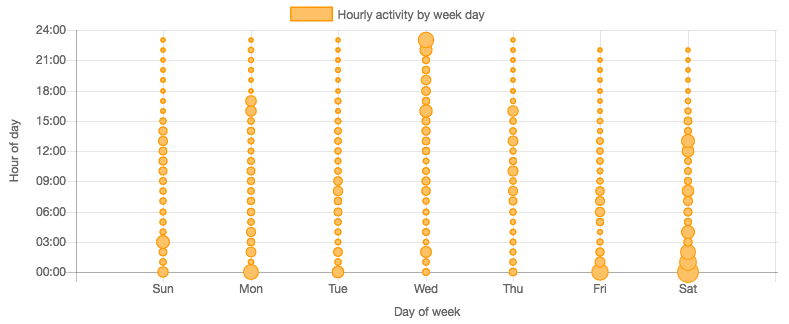
The third chart shows you the time of day and on which days of the week your app is being used. The larger the circle, the more usage of your app there was at that time on that day.
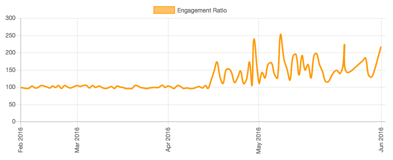
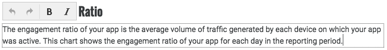
Engagement Ratio
The engagement ratio of your app is the average volume of traffic generated by each device on which your app was active. The first chart shows the engagement ratio of your app for each day in the reporting period.
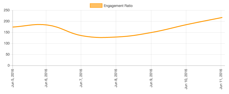
The second chart now compares the above with the engagement ratio of your app for each of the last 120 days. If the engagement ratio is going up, then your users are, on average, using the app more.
Performance
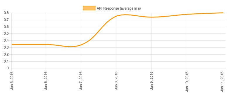
Processing Time
This chart shows the average processing time of API calls generated by your app over the last 120 days.
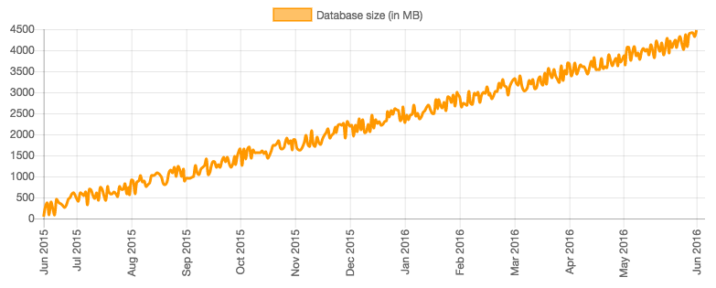
Data Storage
This chart shows how much data is stored in the backend of your app for each day over last 12 months.
Editing a Report
The contents of draft reports can be annotated and customised. To edit a draft report, simply click on the report title from the Reports tab.
Title
The default title is App Summary Report. To change this, click on the title and enter a new title. This is what will be displayed in the Reports tab and in the filename of the PDF.

Date Range
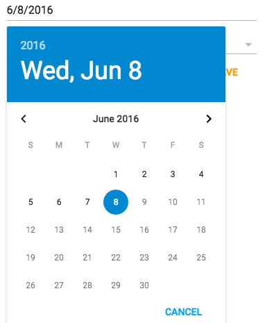
By default, the reporting period is the previous seven days from when the report was generated. To change this, click on the change dates cog next to the date range of the report.
Click on the date to select a new date for the report.
Now, from the drop down, select the desired reporting period:
- The calendar week (of the selected date)
- The calendar month (of the selected date)
- The previous 7 days (to the selected date)
- The previous 30 days (to the selected date)
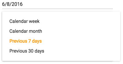
Finally, click Save to change the reporting period.
Executive Summary
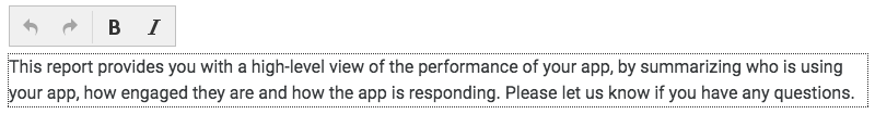
To edit the executive summary text, simply click on the text and an inline editor will appear allowing you customize the text as required. You can undo and redo changes and apply bold and italic styles to your text. Changes are saved automatically at regular intervals.
Section Titles
You can edit any section title by clicking on the title and typing in a new title for that section. The new title will appear in the table of contents.

Editing Text
You can edit all text in the report by simply clicking on the text area you wish to edit and using the inline editor to customize the text as required. You can undo and redo changes and apply bold and italic styles to your text. Changes are saved automatically at regular intervals.
Branding your Reports
If you have applied your branding to your console, then each report will contain your logo and the charts will be rendered according to your chosen color theme.
You can apply your branding to your console and reports from Account Settings.
Publishing a Report
Once you are happy with the content of the report, you can publish the report so that it is available to your client. To publish a report, from the Reports tab, select Publish from the context menu for that Draft Report. The report will now be available to you and your client in Published Reports in the Reports tab for that app.
Downloading as PDF
To download the report as a PDF for emailing to your client (if they do not have a login to the client portal), select Download as PDF from the context menu for that Published Report.
Alternatively, when viewing a published report, you can click the download (primary action) button.
Unpublishing a Report
If you need to go back and make changes to a previously publish report, you can unpublish the report by clicking Unpublish from the context menu for that Published Report. The report will no longer be available to your client and will instead show in the Drafts tab where it can be edited again
Deleting a Report
If you want to delete a draft or published report, you can do this by clicking Delete from the context menu for that report. If the report had previously been published, then once you delete it, the report will no longer be available to your client.