Audience
The Audience tab shows - for the last 30 days, 60 days, 120 days, 6 months, 12 months or All Time - how many users are actively using your app, where these active users are located as well which devices, operating systems and versions of the app they are using.
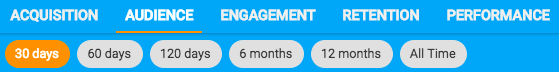
Changing Time Period
By default, the Audience tab shows active installs during the last 30 days. This can be changed by clicking 60 days, 120 days, 6 months, 12 months or All Time as appropriate. All charts in the Audience tab will then update to reflect activity in the selected time period.
Location Map
The location map shows how active installs of the app are distributed between different cities and countries. You can click on the map to expand and interact with it (drag, zoom in/out etc). When expanded, click on any location to see how many active installs the app has in that location in the selected time period.
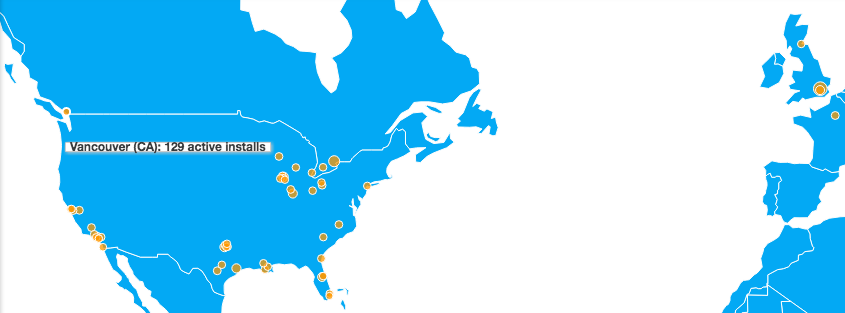
Note that an install can be counted twice, if it was active in more than one location in the selected time period.
Kumulos uses GeoLite2 data created by MaxMind and available from https://www.maxmind.com.
Active Installs
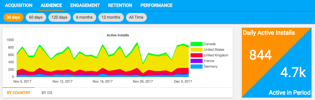
The active installs chart shows the number of daily active installs (for 30 - 60 day periods) or monthly active installs (for 120 day and above time periods). It can be grouped by country or OS to show how active installs compares by geography, or between iOS and Android to compare how this changes over time.
Exploring Data
As with all charts, you can click any series in the legend to temporarily remove this from the chart.
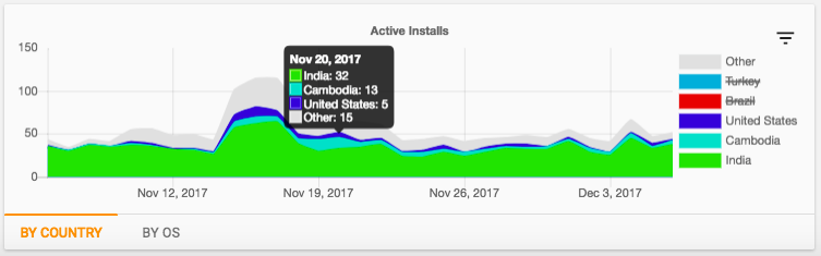
If there are more than six series, the chart will show the top five series (by area) and group the rest into "Other". To explore the data in "Other", click the filter icon in the top-right of the chart and then select the five series that you want displayed (the number in brackets represents the total area of the series - in this case the total of each day's active installs for that series).
Click "Apply" and the chart will update to display the five selected series, again grouping the rest in "Other". You can do this as often as needed to explore the data.
App Stickiness
The widget to the right shows the current number of daily active installs and how this compares to the total number of active installs in the selected time period. If you have selected 30 days, this will therefore be the number of monthly active installs.
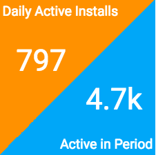
This widget can therefore be used to help calculate how sticky the app is. App stickiness defines what percentage of the app's monthly active users use the app every day and is important to track to see if your users are using the app as often as you want them to.
App Stickiness is calculated by dividing the number of Daily Active Installs by the number of monthly active installs. For the app shown above, stickiness is just under 17%.
OS Versions
The OS Versions pie charts show how the active install base in the selected time period is distributed between different versions of Android and iOS. An install will only ever be counted once, on the last version of the OS that install was active.
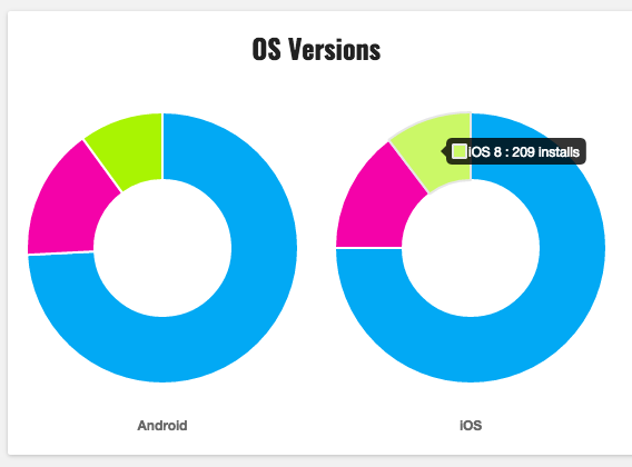
This helps show how up-to-date the active users of an app are with operating system updates and therefore whether or not you need to continue to support older operating systems.
App Versions
The App Versions pie chart shows how the active install base in the selected time period is distributed between different versions of the app. An install will only ever be counted once, on the last version of the app that install was active.
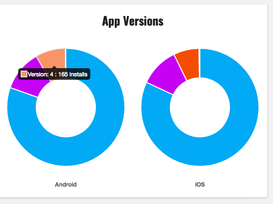
This helps show how up-to-date the active users of an app are with releases and therefore whether or not you need to continue to support older versions of the app or conversely engage users, via a push notification campaign for example, to update to the latest version.
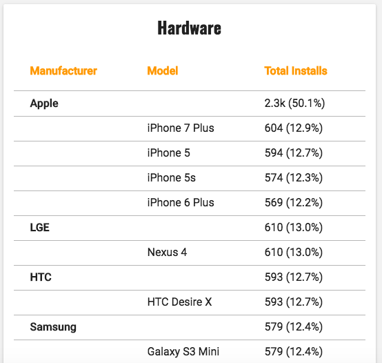
Hardware
The hardware table shows on which devices the app is most active in the selected time period by both manufacturer and model. This gives an insight into how quickly your users are adopting the latest handsets and can shape decisions on representative hardware to purchase for testing and QA.
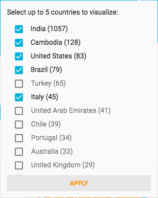
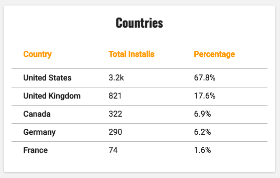
Countries
The countries table shows from which countries the app is most active in the selected time period. This can be used to report on the success of, or highlight the need for targeted push campaigns to drive up engagement in different countries via audience segments.
Kumulos uses GeoLite2 data created by MaxMind and available from https://www.maxmind.com.